

Monday, 10 March 2014
Tuesday, 4 March 2014
Copy and emulation

I looked through this book for inspiration and decided to copy one of his pieces. I chose this artist because it was quite different and simple in a way. But although simple in one way it looks very detailed and intricate in another.
Below are all the pieces that I thought of copying:

 I also liked this one for it's simplicity and thought that it has a lot of relevance to the book cover I am doing as it has leaves which is mentioned in my book when they're in the woods.


This is probably the simplest design out of all of them. However, although it is the simplest it is still very detailed.

I started to practice drawing the different pieces to see which one I would prefer to do as my proper finished copy. This one I enjoyed doing..

Here is another rough copy that I drew.

This is the piece I decided to do a copy of.

Firstly I copied the artwork with a pencil very lightly as I didn't want to have to go rubbing out my pencil lines after O had cut it out with craft knife.

After I had finished drawing it, I started to cut it out with a craft knife.


Unfortunately, I had to cut the letters off because I found it too fiddly to do and I kept accidentally ripping them off.

After I finished cutting it out I look for some coloured paper...

I then started experimenting using Rob Ryan's style but with relelvance of my book:


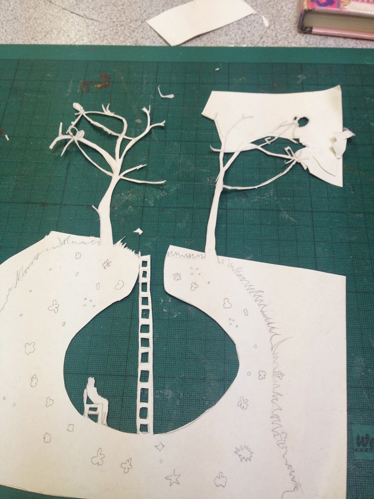
I started off by sticking two pieces of A4 together to make my book cover. I then started to design my emulation.

Here is the design for my front cover, I also designed the flaps and back cover. Thiis emulation has relevance to my book because there is a small drawing of the character Mole, a hill and trees which are all mentioned in the book.

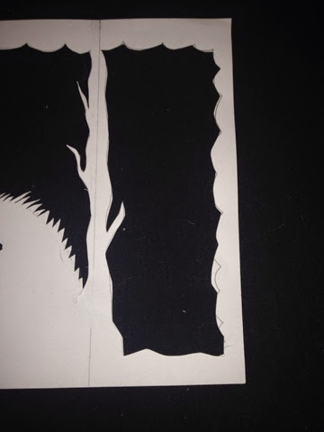
After I finished designing it I started to cut it out using a scalpel.

I took great care with all the delicate bits this time, making sure that I didn't tear anything.

Below are some close ups:


Monday, 3 March 2014


Wednesday, 12 February 2014
Conventions of a book cover spread

The books that I decided to label were 'The Wind in the Willows' which is the book I am designing for my final piece and 'Candyfloss'.


As it is quite an old book it was missing a lot of things like a bar code and information on the right flap. However, I thought it was a good choice of book to label because it is the book that I am going to design for my exam.

Pink: Authors name
Green: Book title
Orange: Illustrators name
Yellow: Award notice

Pink: Barcode
Green: Award label

Orange: Book title
Green: Authors name
Pink: Name of publishing company

Yellow: Synopsis of the book

Yellow: Photo and blurb about the author

Monday, 10 February 2014
Photos of subject matter

As a result from the bad weather recently I captured some images of a fallen tree, this is from the wind which is also one of the elements (air).

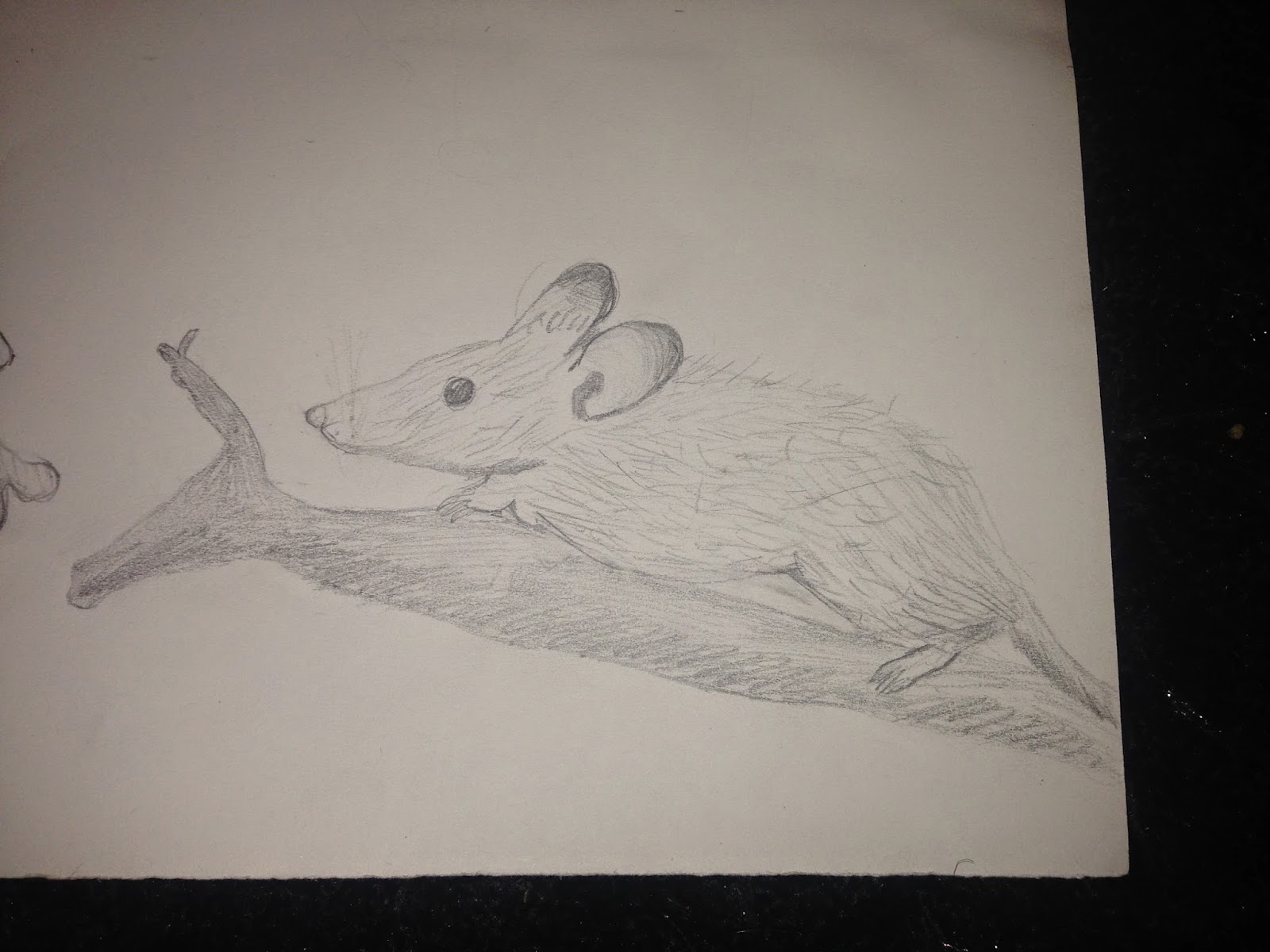
Drawings of subject matter
Gipi:
One of the characters in The Wind in the Willows is Toad, he is quite a significant character in the book.

The main character in the book is a mole called Mole, it would make sense to have him on the front cover.
 A lot of the book covers that I looked at on Pinterest had just an oblique image on the cover, as I was reading the book I noticed that one of the illustrations had a dragonfly. I thought it would be a good drawing to have on the cover because of it being being oblique it adds interest as it's not as obvious. Also, it has relevance to two elements of the theme: water and air. Dragonfly larvae spend most of their life in water, and then when they develop into dragonflys and spend the rest of their lives in the air.

The last thing that I drew was a williow because of the title of the book (Wind in the Willows) this drawing has relevance to the title. However, there isn't much mention in the book about willows.


One of the characters in The Wind in the Willows is Toad, he is quite a significant character in the book.
The main character in the book is a mole called Mole, it would make sense to have him on the front cover.
The last thing that I drew was a williow because of the title of the book (Wind in the Willows) this drawing has relevance to the title. However, there isn't much mention in the book about willows.
Subscribe to:
Posts (Atom)